R, D3, PHP, MySQL, and ggplot2
There are a lot of philosophies over how R should be integrated with internet/web applications, some approaches drive internet applications with R, and others to use R as just another component that can be called as part of a rich content experience. There are pros and cons of both approaches. For various reasons I am a fan of the latter, it helps to compartmentalise code functionality which helps with the whole model view controller (MVC) approach. This way R or any other component is readily substituted with another tool. It also helps when if you want to make radical changes to your web interface, your data model code does not also have to change. There are a few packages for plotting charts for web applications, a very nice option is the googleVis package.
There are many facets to this blog entry; I am using many different programming tools if nothing but to prove that at Active Analytics, we are very promiscuous when it comes to programming languages. As the title suggests we will be using, discussing, disseminating, and presenting code in the R, D3 (JavaScript), PHP, MySQL, languages and we will also use the ggplot2 R package.
Note we will be working using using Ubuntu so not everything we do here will be done in the same way as on a Windows OS. For instance, there is currently no Windows release of the RMySQL package on CRAN.
US house prices
The app that we will be creating is based on Single Family Loan Performance Data from Fannie Mae. The aim is to plot house price averages between 1999 and 2013, presenting the mean, median and interquartile range. After preparing the data, we use two approaches to accomplish our aim:
- We use the excellent RMySQL package to write the summarized data to a MySQL database and then send AJAX calls using PHP to MySQL to pull the required data into a D3 JavaScript chart.

- We use the R package that launched a million charts ggplot2 to create PNG image files that are then updated in the browser. There are many options for accessing R functionality in internet applications. The one we will present here is not really being talked about and it almost obscenely simple. We use a PHP system call to an R script to create/update the ggplot2 image file. That’s it! At Active Analytics we are fans of simple things.

An homage to PHP
Speaking of simple things PHP needs to get an extended mention. It is the glue that holds the internet together, it is easy to pick up, well documented and you don’t need to know a lot of it to start creating decent applications. It doesn’t matter if you favour procedural or OOP style, it will serve you well. It even does a bit of functional programming. So hats off to Lerdorf, Gutmans, and Suraski for such a useful tool. Can R and PHP be brought closer together since they both appear to be the masters of their domain? Perhaps we’ll visit this at a later blog.
One technical point is that I am running my demo of this app on a PHP server which I sometimes use for building and demoing small web apps - not for production applications, I prefer it to the simple python server which does not (at least not at the moment) support PHP scripting.
D3
The D3 JavaScript package is very popular nowadays, it has a very granular low level plotting functionality that allows control of every conceivable facet of charting graphics that you would want and then a lot more. Its integration with CSS and SVG as well as its interactivity tools are also what makes D3 popular. There are many other JavaScript charting packages, D3 is interesting and challenging is why I am using it here.
In this blog entry we serve two buffets both with excellent dishes and large portions, it’s up to you to take what you like and enjoy!
Data Preparation
It’s amazing how much time I spent searching for an appropriate dataset for this blog entry. Eventually I decided on the Fannie Mae house price data set.
I liked the housing dataset because it is large, and it is of wide interest - if you are reading this you probably have a roof over your head and are thus interested in the value of the roof you own or the one you hope to. We will be revisiting this dataset in future blogs – which is another reason I chose it.
Downloading the data took quite a while, it is large though I would not call it ‘big data’, we decided to limit the year of interest to between 2003 and 2012 which was about 2.0 GB of data in the original text files.
Loading the data into R
The R code below was basically used to strip the date and price data from the files.
The list.files() function in R is one of those really useful functions that you forget so easily - at least I do. It’s always at the tip of my consciousness when I need it but can never seem to remember its name, I don’t know why that is. But I really like the function for easily pulling in well named files that I need to crunch.
dataPath <- "data/"
# The file names of the data files
dataFiles <- list.files(dataPath, pattern = "^Acquisition_", full.names = TRUE)
Now that we have the file names, the following function returns the time and price data
getData <- function(fPath){
  cat("loading file ", fPath, "\n")
  dat <- read.table(file = fPath, sep = "|", header = FALSE)[,c(5, 7)]
  names(dat) <- c("UPB", "MonthYear")
  dates <- as.Date(paste0("01/", as.character(dat$MonthYear)), format = "%d/%m/%Y")
  dat$Date <- dates
  print(head(dat))
  cat("done\n\n")
  return(dat)
}
We then execute the function on all the data using the old faithful lapply() function. Then we do.call(rbind, ...) to get our data.frame. Notice that in the above function I transform the %m/%Y data to a full date by appending the first day of the month and converting to the date format.
# Load all the datasets
priceData <- lapply(dataFiles, getData)
priceData <- do.call(rbind, priceData)
Once you have date format it relatively straightforward to pull components of date from this, days, months, years etc. by using the format() function.
priceData$month <- format(priceData$Date, format = "%m")
priceData$year <- format(priceData$Date, format = "%Y")
priceData <- priceData[,c("year", "month", "MonthYear", "Date", "UPB")]
names(priceData) <- c("year", "month", "monthyear", "date", "price")
The prices are rounded to the nearest thousand, may as well divide by a thousand. In cases like this the plotting function can often take care of this so you may chose not to transform the data.
priceData$price <- priceData$price/1000
I then save the data.
# Save the raw data
save(priceData, file = "data/rawData.RData")
Phew, that was relatively painless … be aware that because of the data size it does take a while to run this script. Note also that it may be useful to use the garbage collector gc() function periodically.
Summarizing the data
So we restart R and load the data
# Load the data
load(file = "data/rawData.RData")
Now we use the by() function to summarize the data. There are many ways to do this, so please don’t bite my head off! I like the by() function, it is straightforward to use and in base R, I try not to load packages until I am at the end of what can be ‘reasonably’ accomplished using the base R functionality.
# Summarize the data
summ <- by(priceData, list(priceData$date), function(tab){
  ranges <- as.vector(quantile(tab$price, c(0.25, .5, .75)))
  dat <- data.frame(year = tab$year[1], date = tab$date[1], mean = round(mean(tab$price), digits = 1),
                    lower = round(ranges[1], digits = 1), median = round(ranges[2], digits = 1),
                    upper = round(ranges[3], digits = 1))
  return(dat)
})
Again we bind the resulting by-list item into a data.frame.
summ <- do.call(rbind, summ)
rownames(summ) <- NULL
Then save it to file
save(summ, file = "data/sumData.RData")
And then write it to the mysql database using the RMySQL package:
# Write the data to mysql database
require(RMySQL)
# create a connection
con <- dbConnect(MySQL(), user="user_name", password="password",
                  dbname="database_name", host="your_host")
dbWriteTable(con, "price_summary", summ, overwrite=TRUE, row.names=FALSE)
# Close connection
dbDisconnect(con)
Phew again, relatively painless.
The HTML code
This is a fairly trivial application, all we need is a drop-down selector and a button to execute our select. You could make scripts execute on the selector rather than waiting for the button press. The select items could be populated from a php file but for simplicity, here is the full html code.
<h1>House price Chart: D3 Version</h1>
	<div class="chart" id="chart1"></div>
		<select id="year" name="year">
		<option value="2003">2003</option>
		<option value="2004">2004</option>
		<option value="2005">2005</option>
		<option value="2006">2006</option>
		<option value="2007">2007</option>
		<option value="2008">2008</option>
		<option value="2009">2009</option>
		<option value="2010">2010</option>
		<option value="2011">2011</option>
		<option value="2012">2012</option>
	</select>
<button onclick="updateChart()">Update Chart</button>
<p>The above chart shows US house prices obtained from fannie mae
	data plotted using D3 and php calls to mysql.</p>
Some of you will know that the interesting stuff happens in the <button onclick="updateChart()"> part of the code. The html code for the ggplot2 version of the application is no different apart from that I gave the div where the chart lives a different id.
Phew, again that was very easy. Next we will tackle the D3, CSS, & JavaScript part of the code.
Plotting with D3
Before delving into the D3 Javascript there is some CSS that takes care of some basic stuff on the plot, e.g. chart size, plot element colours etc. The CSS code pertinent to the plot is given below.
.chart{
	width: 900px;
	height: 500px;
	border: 1px solid;
	margin-bottom: 20px;
}

.axis{
	font-size:13px;
}

.axis path,
.axis line {
	fill: none;
	stroke: #000;
	shape-rendering: crispEdges;
}

.x.axis path {
}
.area {
	fill: #efefef;
}

.area:hover{
	opacity: .5;
}

.mean {
	fill: none;
	stroke: red;
	stroke-width: 1.5px;
}

.mean:hover{
	stroke-width: 4px;
}

.median {
	fill: none;
	stroke: #5a90bd;
	stroke-width: 1.5px;
}

.median:hover{
	stroke-width: 4px;
}

.meanDots {
  stroke: #000;
}

.medianDots {
  stroke: #000;
}
Anatomy of the D3 plots
There are six main parts to the D3 code for the plot given here:
- Define your scales
- Define your axes
- Define your plotting elements: lines, points, areas, etc
- Define the domain of the data
- Define how each plot element is appended to the plot area
- Define any desired interactions between the user and the plot/graphic.
… that is how much of basic charting D3 code works.
D3 Plotting functions
Okay let’s start by defining some global variables.
var margin, width, height, x, y, xAxis, yAxis, line, svg, area;
Then the awful looking function that defines the plot. As long as you bear in mind the main parts of the code you can successfully traverse the code below.
function createChart(data){
	margin = {top: 20, right: 20, bottom: 30, left: 50},
		width = 900 - margin.left - margin.right,
		height = 500 - margin.top - margin.bottom;

	parseDate = d3.time.format("%Y-%m-%d").parse;

	x = d3.time.scale()
		.range([0, width]);

	y = d3.scale.linear()
		.range([height, 0]);

	xAxis = d3.svg.axis()
		.scale(x)
		.orient("bottom")
		.tickFormat(d3.time.format("%m/%y"));

	yAxis = d3.svg.axis()
		.scale(y)
		.orient("left");

	area = d3.svg.area()
		.x(function(d) { return x(parseDate(d.date)); })
		.y0(function(d) { return y(d.lower); })
		.y1(function(d) { return y(d.upper); });

	mean = d3.svg.line()
		.x(function(d) { return x(parseDate(d.date)); })
		.y(function(d) { return y(d.mean); });
	median = d3.svg.line()
		.x(function(d) { return x(parseDate(d.date)); })
		.y(function(d) { return y(d.median); });
	svg = d3.select("#chart1").append("svg")
		.attr("width", width + margin.left + margin.right)
		.attr("height", height + margin.top + margin.bottom)
		.append("g")
		.attr("transform", "translate(" + margin.left + "," + margin.top + ")");

	var tooltip = d3.select("body")
		.append("div")
		.style("position", "absolute")
		.style("z-index", "10")
		.style("visibility", "hidden")
		.style("font-size", "13px");

	x.domain(d3.extent(data, function(d) { return parseDate(d.date); }));
	y.domain([d3.min(data, function(d) { return d.lower; }), d3.max(data, function(d) { return d.upper; })]);

	svg.append("path")
		.datum(data)
		.attr("class", "area")
		.attr("d", area);

	svg.append("path")
		.datum(data)
		.attr("class", "mean")
		.style("stroke-dasharray", ("2, 4"))
		.attr("d", mean);

	svg.append("path")
		.datum(data)
		.attr("class", "median")
		.style("stroke-dasharray", ("4, 2"))
		.attr("d", median);

	svg.append("g")
		.attr("class", "x axis")
		.attr("transform", "translate(0," + height + ")")
		.call(xAxis);

	svg.append("g")
		.attr("class", "y axis")
		.call(yAxis)
		.append("text")
		.attr("transform", "rotate(-90)")
		.attr("y", 6)
		.attr("dy", ".6em")
		.style("text-anchor", "end")
		.text("Price (000's $)");

	svg.selectAll(".meanDots")
		.data(data)
		.enter().append("circle")
		.attr("class", "meanDots")
		.attr("r", 3)
		.attr("cx", function(d) { return x(parseDate(d.date)); })
		.attr("cy", function(d) { return y(d.mean); })
		.on("mouseover", function(){return tooltip.style("visibility", "visible");})
		.on("mousemove", function(d){
			var point = d3.select(this);
			point.attr("r", 5)
				.style("fill", "steelblue");
			return tooltip.html("Mean: " + d.mean)
				.style("left", (event.pageX- 15) + "px")
				.style("top", (event.pageY - 20) + "px");
		})
		.on("mouseout", function(){
			var point = d3.select(this);
			point.attr("r", 3)
				.style("fill", "#333");
			return tooltip.style("visibility", "hidden");
		});

	svg.selectAll(".medianDots")
		.data(data)
		.enter().append("circle")
		.attr("class", "meanDots")
		.attr("r", 3)
		.attr("cx", function(d) { return x(parseDate(d.date)); })
		.attr("cy", function(d) { return y(d.median); })
		.on("mouseover", function(){return tooltip.style("visibility", "visible");})
		.on("mousemove", function(d){
			var point = d3.select(this);
			point.attr("r", 5)
				.style("fill", "steelblue");
			return tooltip.html("Median: " + d.median)
				.style("left", (event.pageX - 15) + "px")
				.style("top", (event.pageY - 20) + "px");
		})
		.on("mouseout", function(){
			var point = d3.select(this);
			point.attr("r", 3)
				.style("fill", "#333");
			return tooltip.style("visibility", "hidden");
		});

}
In relation to our html the line svg = d3.select("#chart1").append("svg") is important because this is where the plot is attached to the web page.
To make the above D3 JavaScript function work, we need to provide data. We do this using AJAX to send a query to a PHP script supplying the year we would like to get the data for and getting back the data itself from the MySQL database. For now we will stick with the JavaScript part and cover the rest later on.
The function below actually does the plotting, it collects the data from the $("#year") id sends it to the PHP file called fetch_data.php we then use this data to drive the chart and hey-presto! you have your chart.
function plotChart(){
	$.ajax({
		url:"fetch_data.php",
		type: "GET",
		data: $("#year").serialize(),
		dataType: "json",
		success: function(data){
			data = data.slice();
			createChart(data);
			console.log("Chart successfully plotted.\n");
		},
		error: function(){
			console.log("There was an error at chart initilization.\n");
		}
	});
}
Now for the rest of the JavaScript details …
Every time a new year selection is made from our web GUI and the Update Chart button is clicked, we we want to either replace the relevant part of the chart, or replace the chart as a whole with a new chart. I have opted to do the latter shown in the code that is actually called by the button press …
function updateChart(){
	$("#chart1").empty();
	plotChart();
}
The R versions of these functions are the same, but the function that creates the R chart is pretty easy - easier than the D3 function above.
Here we simply pop in the PNG image file …
function appendRChart(){
var chartDiv = $("#chart2");
chartDiv.empty();
chartDiv.prepend('<img src="images/rplot.png" />');
}
And here we execute the plot by updating the image file with the rplot.php
function plotRChart(){
	$.ajax({
		url:"rplot.php",
		type: "GET",
		data: $("#year2").serialize(),
		success: function(){
			appendRChart();
			console.log("Chart successfully plotted.\n");
		},
		error: function(){
			console.log("There was an error at chart initilization.\n");
		}
	});
}
On page load, we run the following function to populate out charts.
$(function(){
	plotChart();
	plotRChart();
});
We have crested the mountain of code from now on it’s a relaxing down hill stroll. Let’s take a look at the PHP code.
The PHP glue
The fetch_data.php file is shown below, the login details are defined (but not shown). The query to MySQL database is executed in the sqlQuery.php script file. The important point to note is that we use the $_GET[] to pull in the year data from the the AJAX call.
<?php
require_once("sqlQuery.php");
$year = $_GET["year"];
$data = sqlQuery("select * from price_summary where year=".$year, $username, $password, $dbname, $host);
echo $data;
?>
The sqlQuery.php PHP script file is shown below
<?php
function sqlQuery($sqlString, $username, $password, $dbname, $host){

	// open the connection
	$con = new PDO("mysql:host=" . $host . ";dbname=". $dbname, $username, $password);

	// Execute query
	$result = $con->query($sqlString);
	$data = $result->fetchAll(PDO::FETCH_ASSOC); // Without the flag it fetches both numeric and assoc.
	$data = json_encode($data, JSON_NUMERIC_CHECK); // Flag checks that numeric data is encoded as numeric
	return $data;
}
?>
The above code is pretty simple, and doesn’t need much in the way of explanation, suffice it to say that it allows us to connect to the MySQL database and return the desired data as a JSON object.
Okay then what about R? How does rplot.php work? You’ll laugh when you see this … yes its a system call.
<?php
$year = $_GET["year"];
$command = "R CMD BATCH " . "'--args year = " . $year . "'" . " ../r/02_plot.r";
echo "R command run: " . $command . "\n";
system($command);
?>
Next we will look at the R script that is run on this system call.
The ggplot2 R chart
The bit you should really pay attention to is the commandArgs(TRUE) function that allow the arguments defined in the above PHP system call in the --args flag to be passed through to the R script.
args=(commandArgs(TRUE))

require(ggplot2)
require(scales)

load(file = "/... path .../data/sumData.RData")
eval(parse(text=paste0(args, collapse = "")))

dat <- summ[summ$year == year,]

png("/... path .../images/rplot.png", width=900, height=500)
ggplot(dat, aes(x = date)) +
  geom_ribbon(aes(ymin = lower, ymax = upper), fill = "#efefef") +
  geom_line(aes(y = mean), color = "red", linetype = 3) +
  geom_line(aes(y = median), color = "#5a90bd", linetype = 2) +
  geom_point(aes(y = mean), size = 3) + geom_point(aes(y = median), size = 3) +
  theme_classic(base_size = 15) + xlab("") + ylab("Price (000's $)\n") +
  scale_x_date(labels = date_format("%m/%y"), breaks = date_breaks("months")) +
  scale_y_continuous(breaks=pretty_breaks(10))
dev.off()
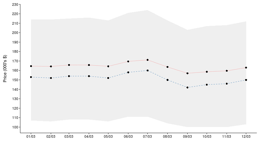
So that’s it, there’s no more code to look at, below I show the output of the ggplot2 chart which is pretty much the same as the output from D3.
Note though that if you use this R based technique it will be slower because R has to write the PNG file (slow) and then it has to be sent to your browser to be rendered there (also slow). In the D3 app, all that needs to happen is a small amount of JSON data to be sent to the JavaScript application from MySQL (fast).
Conclusion
Internet-based programmers have been interfacing data with web interfaces for decades - which is centuries in internet years a bit like dog years to the nth power. R is a great statistical tool and needs to stay that way and continue to improve the stuff it is good at. An important part of application building is being able to interface the right technolgies together to get the desired outcome. With data analytics becoming more important in many applications, successful integration of R into web applications is very crucial. I believe that the best way to do this is by looking at the interface between R and web technolgies to make it an easily interfaced and exchangeable (and thus more incorporatable) component in this field. There has been work on this and some ongoing dev projects that I hope to cover in forthcoming blog entries.
We presented alot of stuff in this blog entry. We wanted it to reflect the relaunch of Active Analytics, growing out of being just an R company to a more general data science consulting, training and application development company. Of course R will always be important to what we do, but there are many interesting tools to use for different applications that we can explore here.
That’s it, you can go off and do some work now.